Designed with purpose from day one.
A distinctive logo should capture what makes a business different—and make that difference instantly recognisable.
WHAT MAKES A STRONG LOGO IN 2027?
A strong logo speaks for itself.
The most memorable logos need no lengthy explanation. Through form, balance and a single clear idea, they express something essential about the business behind them.
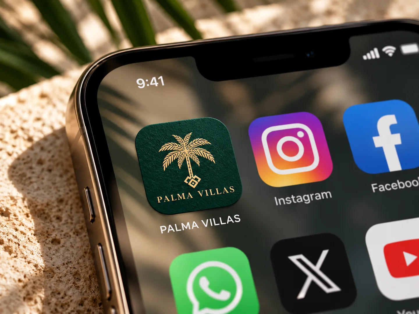
That idea must hold wherever the brand appears: on a website, in a social feed, across printed materials and signage, or as a tiny favicon.
Great logo design brings together character, precision and flexibility—not decoration for its own sake.
Even at 32 pixels, it should still be unmistakably yours.
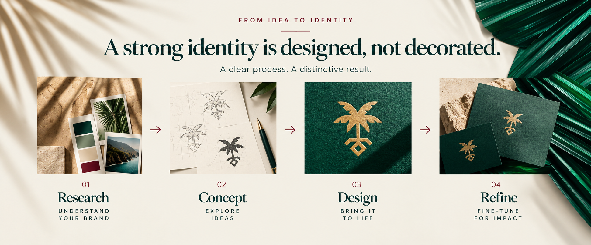
FROM IDEA TO IDENTITY
A strong identity is designed, not decorated.
A clear process. A distinctive result.
RECOGNITION & SYMBOLISM
One idea. A lasting impression.
A distinctive logo begins with something worth remembering: a letterform, a symbol, a shape or a subtle reference to the business itself.
It doesn't need to catalogue every service. It needs one clear visual signature—something people can recognise even when the name isn't there.
The strongest symbols feel deliberate rather than decorative. Their story may unfold over time; their presence should be immediate.
Clarity is more memorable than cleverness.
SIMPLICITY & CLARITY
Nothing extra. Nothing accidental.
Every line competes for attention. Remove what is unnecessary and the essential idea becomes stronger, whether viewed on a screen, printed on paper or reproduced at small scale.
That isn't a call for every brand to look minimalist. It's a case for making every design decision count.
Every element should earn its place.
COLOUR, TYPOGRAPHY & VISUAL LANGUAGE
One brand. One visual language.
Before anyone reads your copy, colour and typography have already established a tone.
A refined serif can suggest heritage; a modern sans serif can feel direct and precise. Colour and imagery carry that personality through every interaction.
Together, these choices create a recognisable world—not a collection of unrelated design elements.
Consistency makes a brand feel unmistakably itself.
Illustrative brand study · Palma Villas is a fictional concept
DESIGNED FOR REAL LIFE
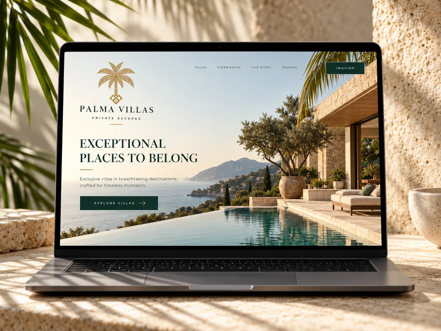
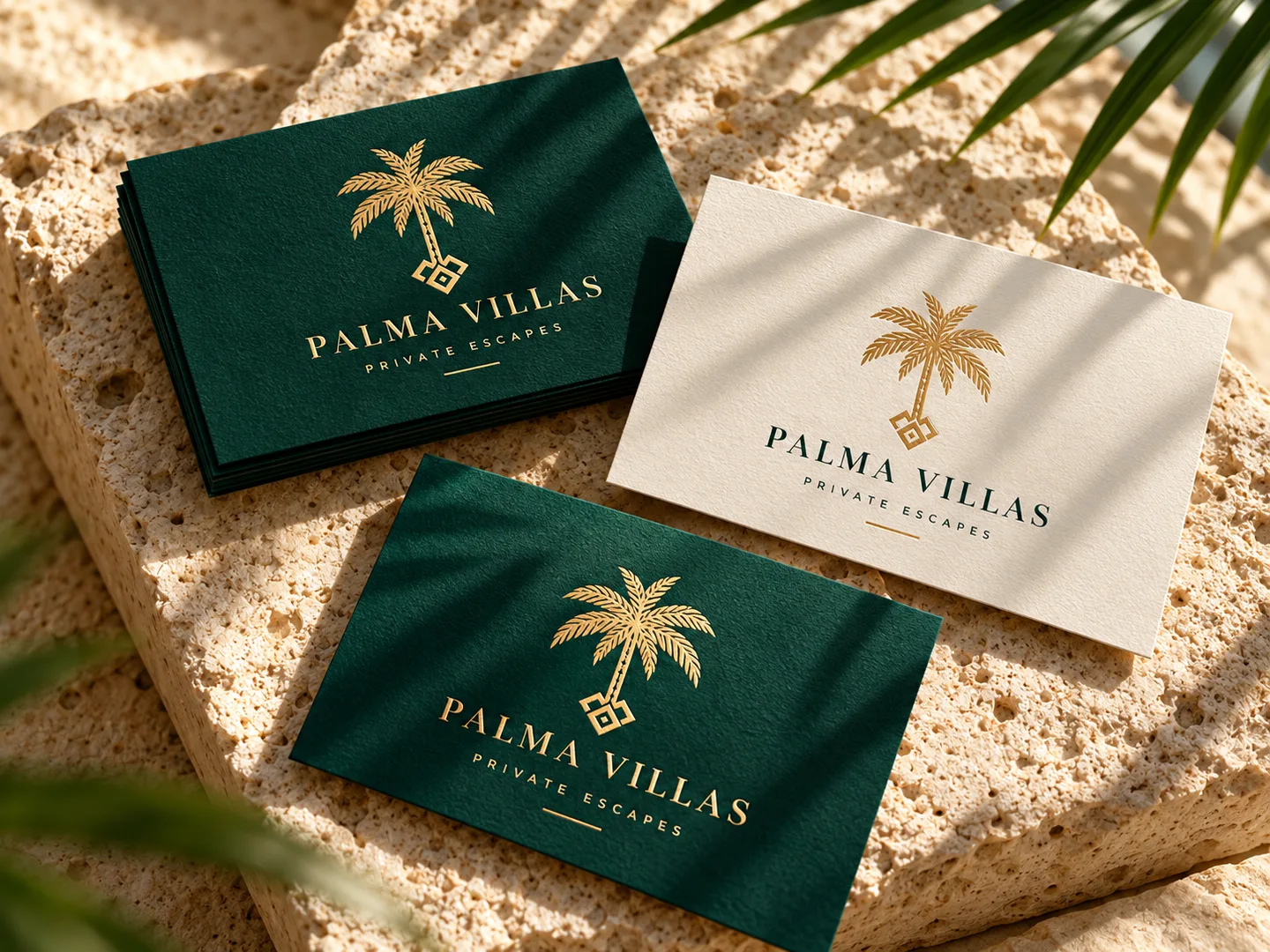
One identity. Every touchpoint.
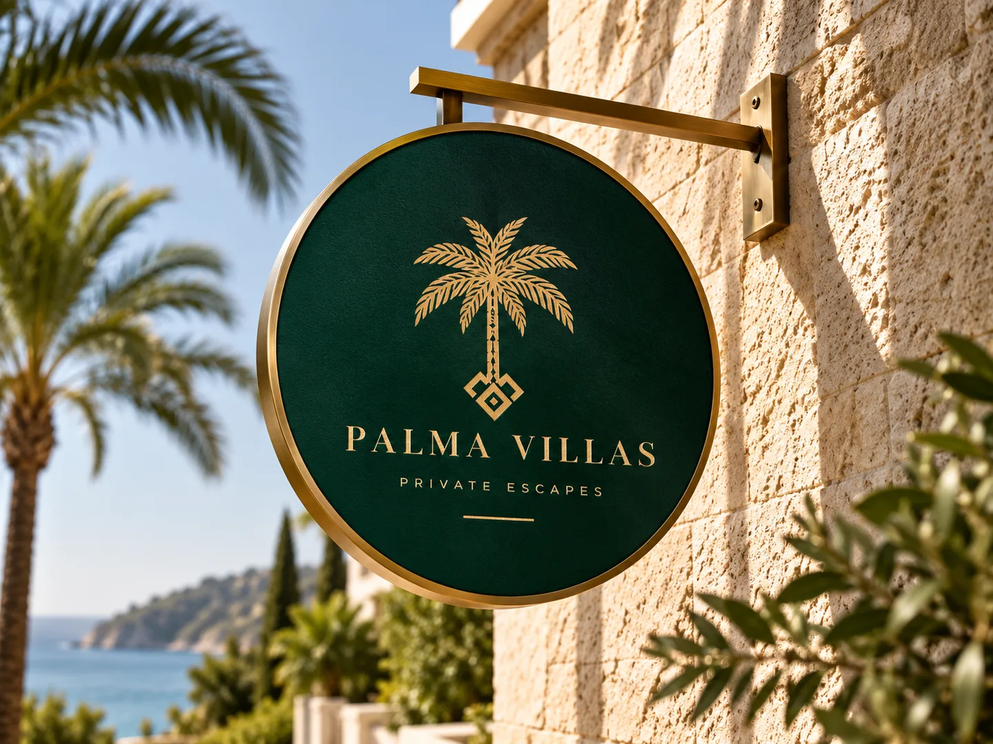
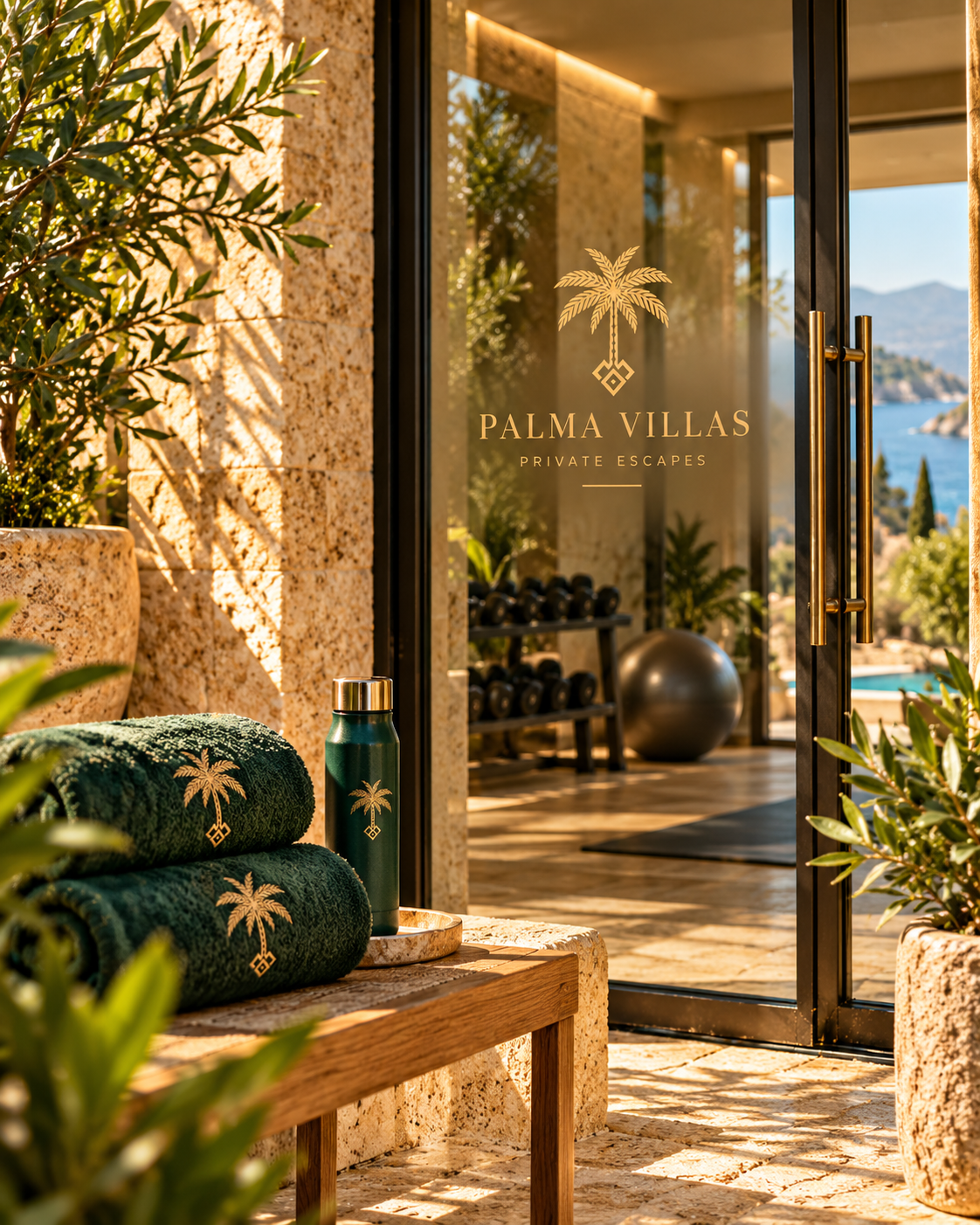
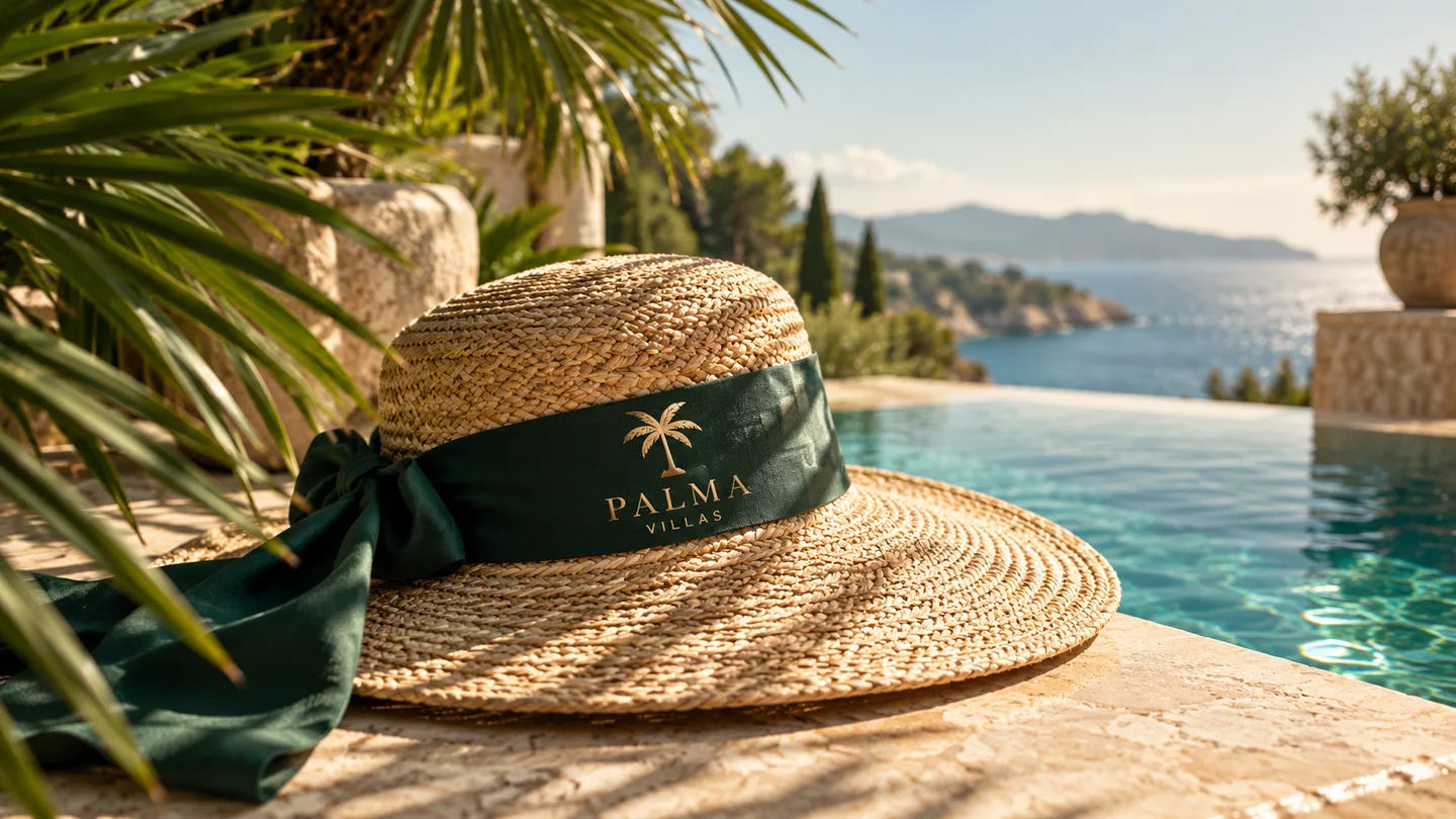
From screen to signage, a distinctive mark should feel unmistakably the same.
BEYOND THE LOGO
More than a logo. A complete visual language.
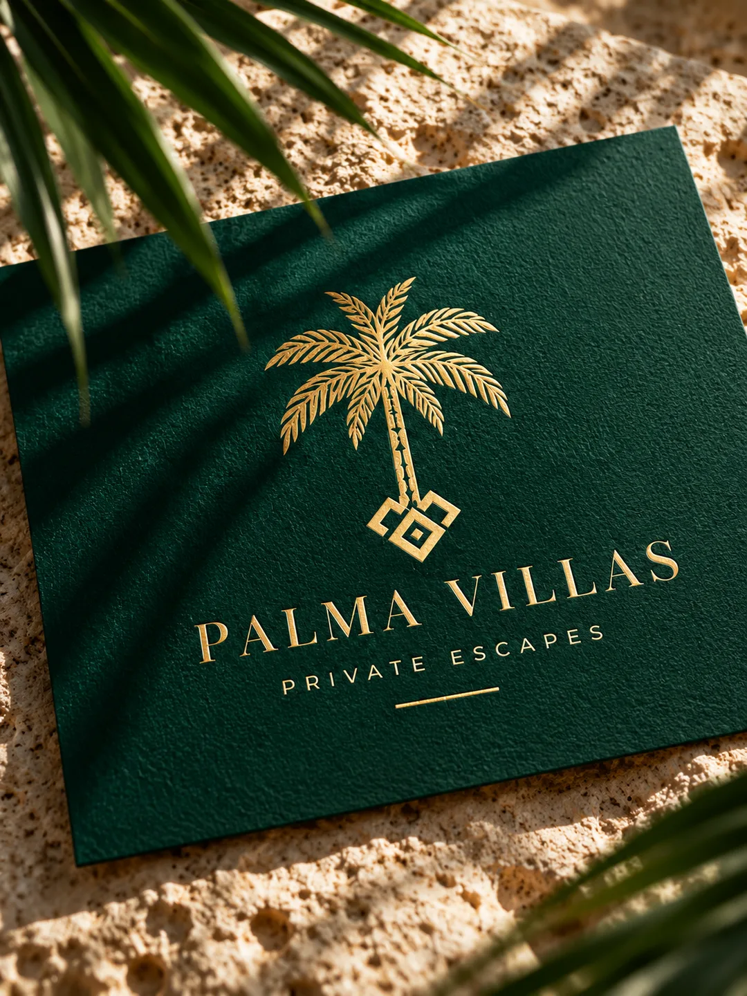
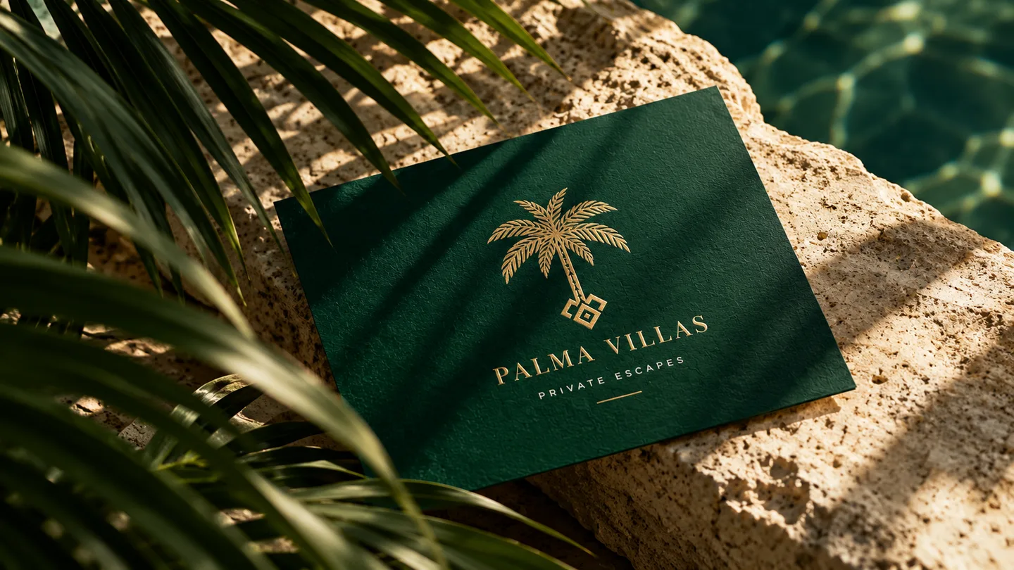
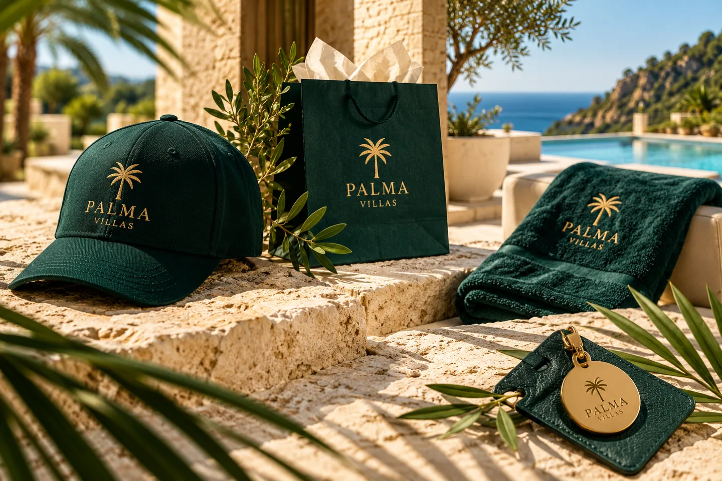
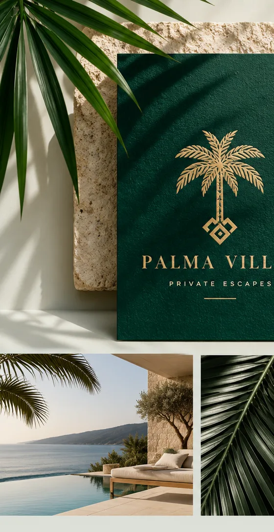
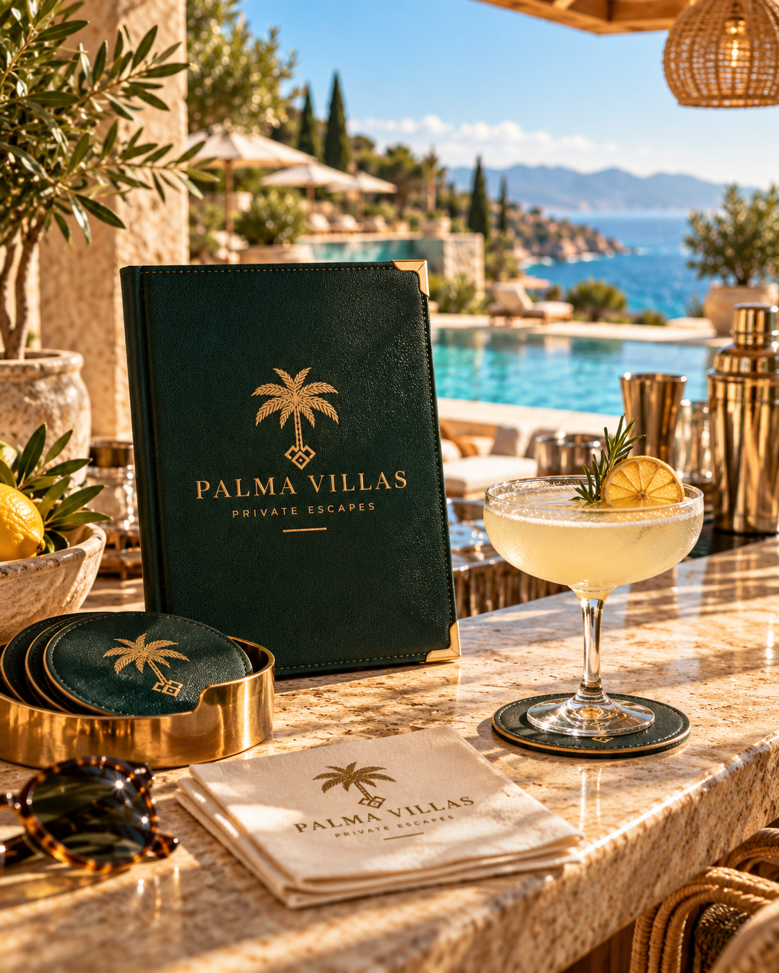
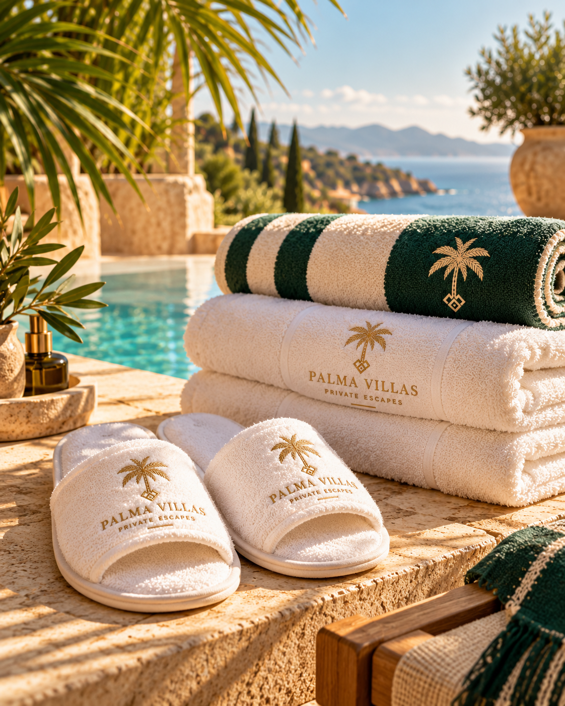
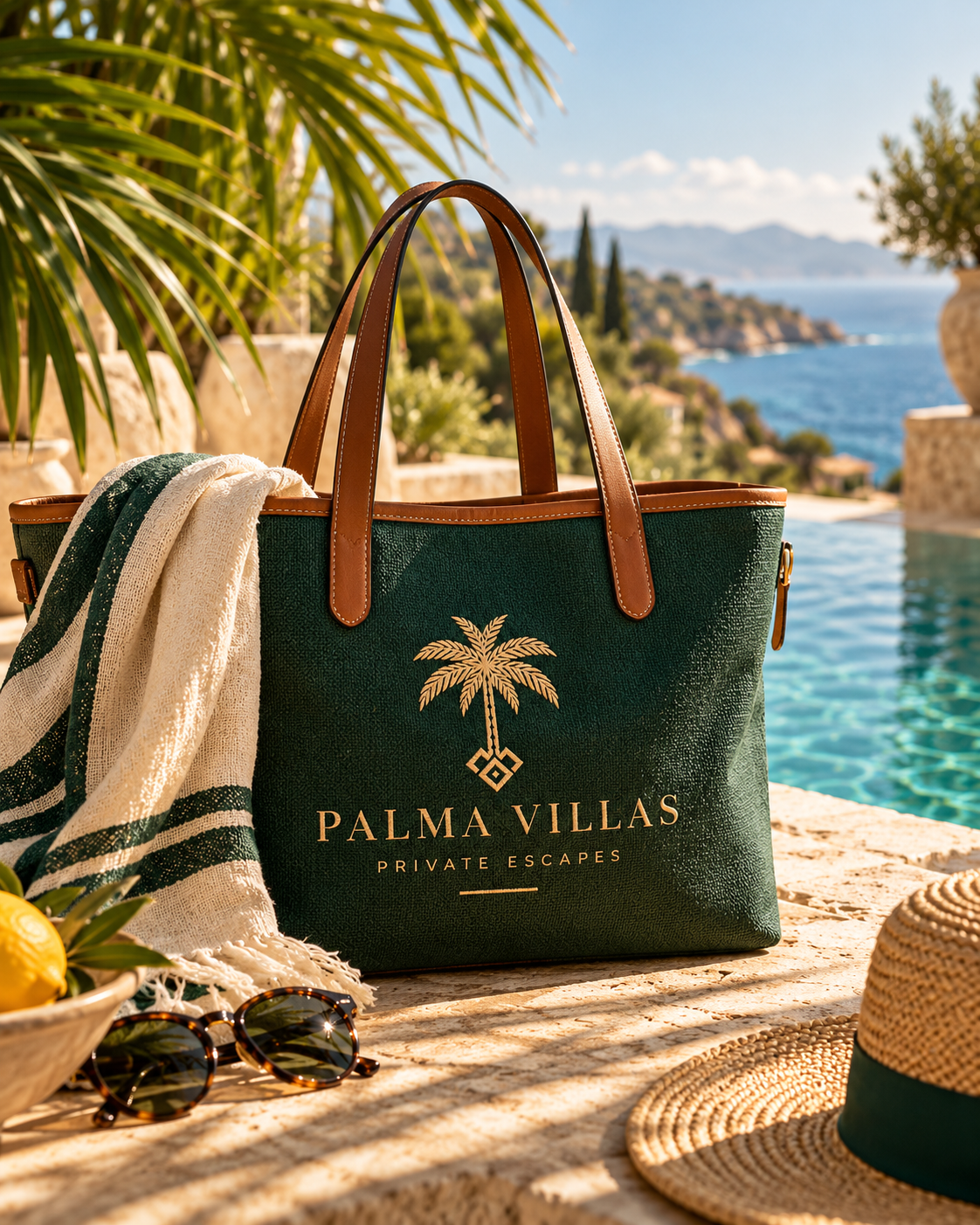
Deep forest green, warm gold and the softness of coastal light create a visual world that feels unmistakably Palma Villas.
Forest green · Sage · Mist green · Sand · Burgundy
BEFORE & AFTER
From first sketch to signature mark.
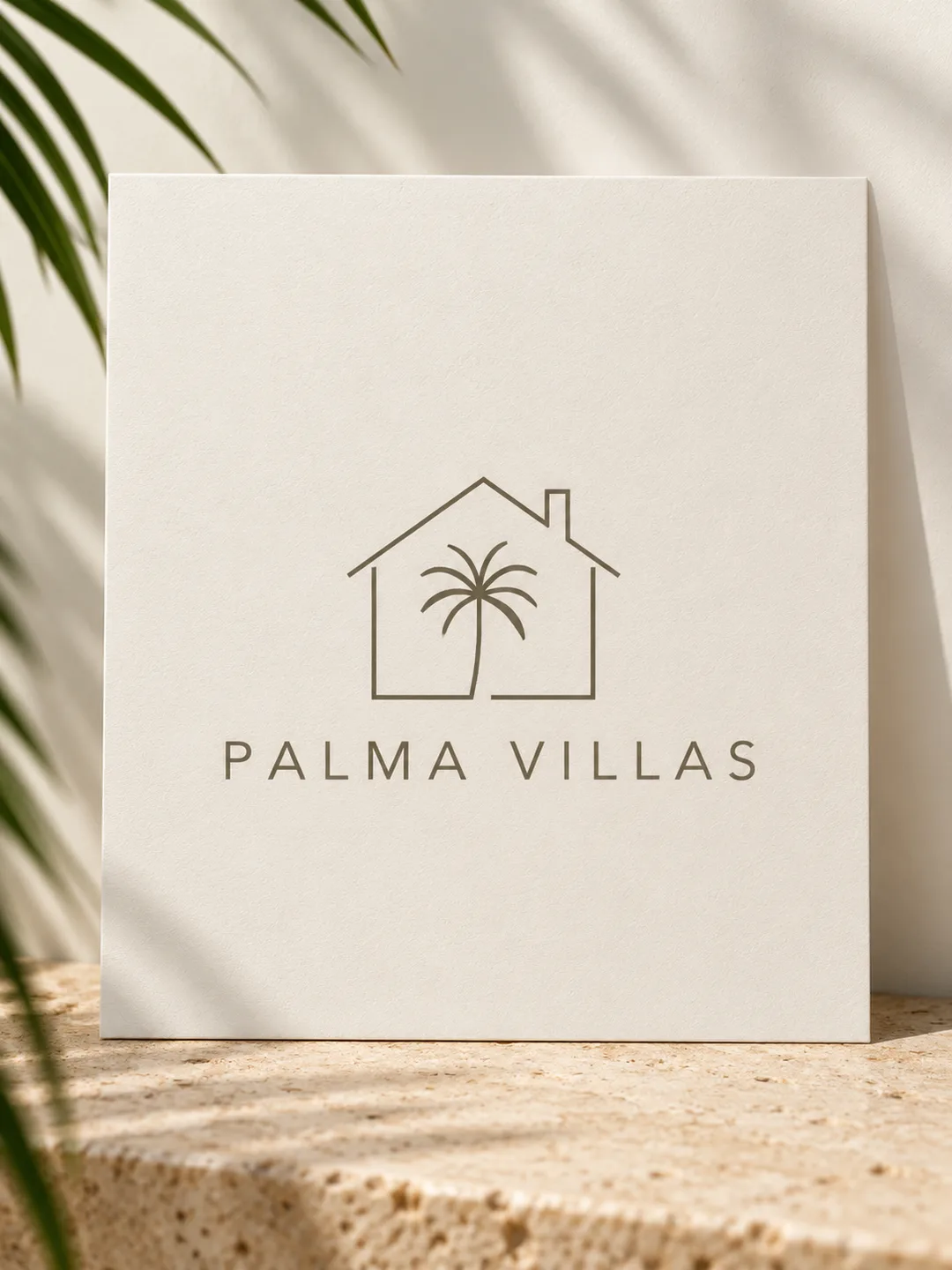
Through careful refinement, a first idea becomes a clearer, more memorable mark with a character all its own.
A BRAND WITH CHARACTER
Timeless. Modern. Unmistakable.
YOUR NEXT STEP
Let's bring your brand to life.
A distinctive mark. An identity that feels like yours.